[Part 1: Percentile Inflation is the first of a three-part report on the new PSAT. See Overview, Part 2: Score Discrepancies, and Part 3: Lowered Benchmark. The entire report can also be downloaded or distributed as a PDF.]
Part 1: Percentile Inflation
A series of changes has greatly increased the percentile scores that students and educators are seeing on PSAT score reports. College Board has not been transparent about all of the changes and the ways in which they can distort score interpretation.
Moving the Goalposts: A New, Hypothetical Measuring Stick
A shift in percentile reference groups has, perhaps, caused the most immediate and pervasive confusion in interpreting score reports. Many PSAT report recipients assume that percentiles are calculated directly from the current pool of test-takers. Surely, a 55th percentile score for a section should mean that of current test-takers, 55 out of 100 scored at or below that section score. That’s not the case and has almost never been the case.
College Board has long used the previous year’s test-takers as the reference group for PSAT/NMSQT percentile calculations. Those students provided the measuring stick, so to speak. Since the pool of test-takers evolves slowly, the difference between comparing 2014 students to 2013 students and comparing 2014 students to each other would not have been pronounced. With the 2015 PSAT, College Board has introduced an entirely new measuring stick — a “nationally representative sample” [also referred to as the “National Representative sample”] — and made it the default norm for student score reports. Here is College Board’s definition:
“Nationally representative percentiles are derived via a research study sample of U.S. students in the student’s grade (10th or 11th), weighted to represent all U.S. students in that grade, regardless of whether they typically take the PSAT/NMSQT.”
In other words, test-takers are compared to students who didn’t even take the test and may never take the test. These percentiles are displayed prominently alongside student scores in both online and printed reports. We find that parents and students are using these percentiles as their primary source of information. Unfortunately, these “nationally representative” percentiles have several problems:
- they provide a source of percentile inflation
- they do not accurately compare students to the pool of students likely to take the SAT or ACT
- they represent a break from past reporting and mean that these figures cannot be compared to any prior data
- they represent a “black box” — it is unclear exactly how the national sample is derived, how accurately it reflects the national pool of students, or when or if it will be modified in the future.
College Board often cites transparency as a goal for its programs and as a justification of the new PSAT and SAT. Nationally-representative percentiles seem far less transparent than traditional test-taker percentiles. The new percentiles are not based on college bound students. The new percentiles are not based on others taking the same exam. The new percentiles are based on numbers that can only be judged via a technical report — such a report has yet to be released.
National Users: Students Become “Users” and Study Samples Replace Actual Results
An alternate set of percentiles, “User: National,” is also provided, but each score in the second set is only found several clicks deep in the online version of the report. In fact, a full student report contains 25 separate percentile scores. The temptation is to view “User” as interchangeable with the traditional notion of “test-takers,” but that would be inaccurate. The PSAT previously presented percentiles based on “[students] who took the test last year,” but the new PSAT has no “last year” from which to draw. Rather than opting to use actual student data from 2015 test-takers, College Board created a new reference group:
“User group percentiles are derived via a research study sample of U.S. students in the student’s grade, weighted to represent students in that grade (10th or 11th) who typically take the PSAT/NMSQT.”
This procedure is not uncommon, but that does not ensure that it was done accurately this time. At minimum, it creates another black box for students and educators. It’s a remedy that did not need to exist. Consider, by contrast, that the SAT and ACT are taken on many different dates over sophomore, junior, and senior year of high school. If a student is to get an accurate sense of how she stacks up to other students in her class, data from her class’s testing history must be consolidated. Since percentiles cannot be calculated contemporaneously with score reports, the testing organizations use scores from a prior group of test-takers. College Board uses the previous class year for the SAT, whereas ACT traditionally uses the prior three years. The data consolidation rationale does not exist for PSAT/NMSQT percentiles. As of October 28, 2015, every student who would ever take the 2015 PSAT/NMSQT had done so. Full results could have been tabulated and used for percentile calculation and reporting. Instead, College Board elected to use a sampling method that has not been disclosed and that is subject to the error inherent in any sampling.
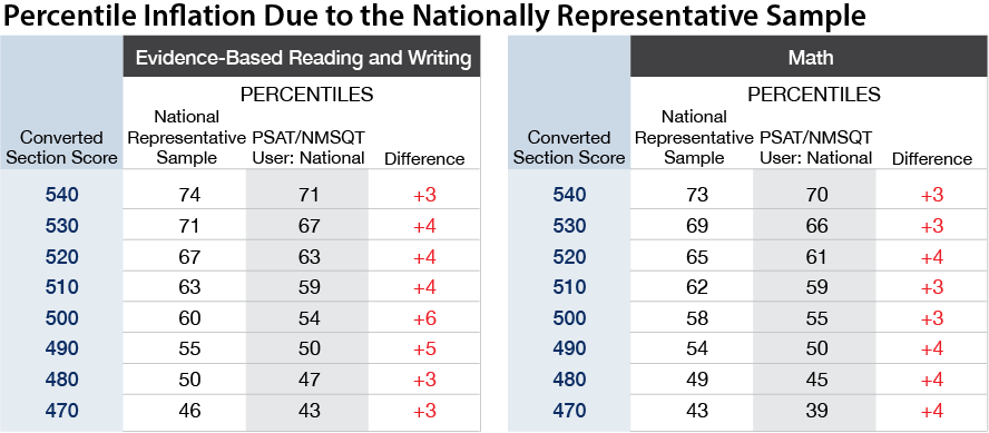
Nationally Representative Scores Result in Percentile Inflation
The table below shows how the Nationally Representative percentiles differ from those for User and increase expected percentile scores. ACT uses prior test-takers only, so the PSAT is unique in this source of inflation.
A Percentile by Any Other Name: College Board Changes a Definition
A more fundamental change underlies all of the percentile scores on the new PSAT report. Few people give much thought to the various ways percentiles are defined, because the measure seems so simple to understand. [In this report, the vernacular “percentiles” will be used with no attempt to distinguish among percentiles, percentile rank, or cumulative percentages.]
In standardized test reporting, the two most common ways of defining percentiles for test-takers vary slightly enough that the distinction often gets overlooked:
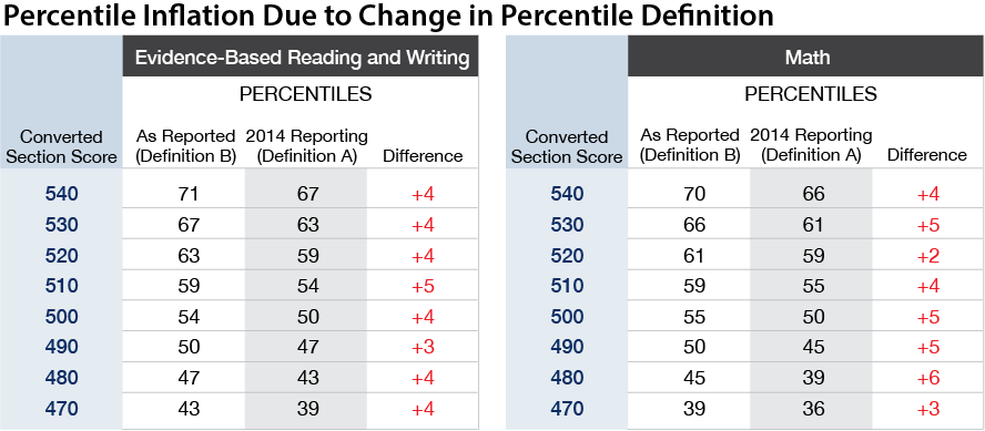
Definition B produces higher values in almost all cases and never give lower values. College Board shifted from Definition A to Definition B this year, introducing an additional source of percentile inflation. Understood in context, there is no negative implication to this inflation — the new definition is just as valid and, perhaps, easier for a layperson to understand. The context, though, is easily lost. There are no red asterisks alerting to the change, so students and educators are understandably — and incorrectly — comparing 2015 percentiles to those from previous years.
Traditionally, College Board used Definition A and ACT used Definition B. It seems fitting that as the SAT and ACT grow more similar in content that their respective organizations now agree on Definition B. It is unclear if College Board will be using this definition for all of its exams. Below is an excerpt of percentile tables for the new PSAT; columns have been added for Definition A to demonstrate how percentile inflation can be observed.
Neither of the percentile definitions provide full information, because percentiles do not convey how many people achieved the same score. Any air traveler has encountered a variant of this problem when “Group 1” is called and 200 passengers rise as one. Having a high score is not as good if too many people share your score.
Definition A indicates what percentage of students achieved lower scores, but it cannot convey what percentage scored higher. For example, by looking at the table above at the cell for a score of 500 Math under Definition A, we can tell that 50 percent of students scored lower. Without referring to other cells, though, we do not know how many scored higher than 500 (it turns out to be 45 percent). In the case of Definition B, we would see that a 500 is the 55th percentile and know that 55 percent scored at 500 or below. This tells us that 45 percent scored higher (100 – 55 = 45). We would not know how many students scored below a 500.
The definitions do not change the underlying data, but students and educators are only provided a single value on their score reports, and it is the new, higher value. It can feel like having $60 in your pocket rather than having $50. It’s a nice feeling until you realize that prices have uniformly gone up by 20%. Across the middle, meatiest part of the score range, the change in definition “raises” percentiles by 2 – 6 points. It is plausible that College Board moved from Definition A to Definition B in part to give the feel-good impression of $60 — especially since ACT was already handing out the extra bills.
Adding Up the Changes
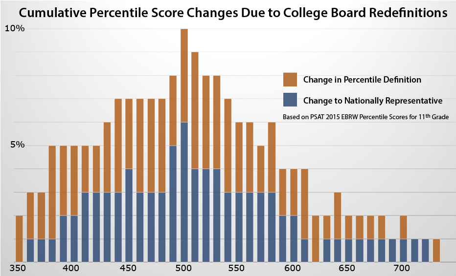
The percentile inflation caused by the new definition and the new reference group are effectively additive. Under 2014’s percentile and reference group definitions, a 500 Math score would be presented as 50th percentile. On a 2015 score report, however, a 500 Math score is the 60th percentile. Percentile inflation is as high as 10 percent over part of the scale. At the edges of the scale, the absolute change is smaller, but the proportional impact is higher. For example, while 99th percentile is only 2 percentile higher than 97th percentile, the cumulative reporting changes from 2014 mean a doubling or tripling of students receiving the higher figure. With 3% of students boasting 99th percentile scores this year, there are important implications for how students, parents, and counselors forecast National Merit scores, for example. Counselors typically see hundreds of reports, so they have been observing this proliferation of high scores without necessarily knowing why.
Percentile Inflation is Distinct from Score Inflation
The changes described above all relate to how percentiles are higher than ones reported in the past. Although scoring inconsistencies also appear to exist this year as a separate concern, percentile inflation in and of itself does not provide evidence that scores have been miscalculated or mis-distributed.
Why Did College Board Make These Changes?
In the course of replacing the old PSAT with the new PSAT, College Board has drawn on samples rather than actuals, swapped in new measuring sticks, and redefined how the measuring gets done.
“Why?”
It is hard to make a case for how students benefit from these changes. Percentile inflation may shift test planning decisions in unwelcome ways, and the sampling methodology and expanded comparison pool do little to answer questions about how a student’s scores stack up against those of other college applicants.
College Board, though, has multiple motives for making these shifts. The organization is under intense competitive pressures from ACT and other testing companies in the fight over whose testing products will be chosen to assess students from middle school to high school graduation. College Board cannot tolerate a competitive disadvantage just to preserve an old definition. Rebranding its ReadiStep product as PSAT 8/9, creating a vertical scale that tracks students across all of its PSAT and SAT instruments, and rebadging the PSAT as the PSAT 10 when taken by sophomores in the spring have all been decisions to expand what College Board now dubs “The SAT Suite of Assessments.” College Board has strived to close any real or perceived competitive deficit, and the shift to the national sample fits into the organization’s long-term plans. States and school districts are increasingly contracting with the organization to offer the PSAT or SAT to all of their students rather than just a self-selected group of college bound students. These bulk buyers prefer standards that compare their students to all grade-equivalent students. The PSAT 8/9 is taken by far fewer students than the PSAT/NMSQT. Test-taker or “user” percentiles are more susceptible to change from exam to exam. College Board would ultimately like to offer the PSAT to every student across the country. It is, in essence, setting a benchmark with the goal of growing into it.
There are statistical reasons, too, why preference was given to a research study sample. Test makers generally want reporting data such as percentiles calculated prior to the administration of a new form. In hindsight, this preference was a risky decision for the PSAT given scrutiny of the exam by both proponents and critics. Many people are left wondering, “Is there something to hide?”
The reasons behind the decision to change the percentile definition and the default reference group may be valid, but the fact that the changes tend to amplify the percentiles and include an opaque leap from test-taker group to a Nationally Representative sample creates a dubious impression. A productive solution would be to release the actual numbers for test-takers and publish all research study results. The new SAT debuts on March 5, 2016, and many of its components are being built on the same research studies and with the same methods used for the PSAT. It would seem prudent to establish credibility with PSAT data now rather than play catch-up after final SAT numbers are released.
Interesting. Where do you get the information that 3% are in 99th percentile?
Curious.
Jill,
The exact percentage varies depending on what score we are looking at, and College Board’s reporting does not provide exact figures. As an example, you can look at the Math percentiles for 11th graders as reported in Understanding Scores, page 8. Students scoring 720 and above would be reported at the 99th percentile in the Nationally Representative Sample. We can determine, though, that use of the national sample and the new “at or below” definition contribute to percentile inflation.
A 720, for example, is only 98th percentile among the user sample. To figure out how many students actually achieved a 720 or higher, though, we need to look at how many score 710 or lower. A 710 is 97th percentile in the User column, so somewhere between 96.5% and 97.5% of the user sample got 710 or lower. That leaves us to conclude that between 2.5% and 3.5% of students scored at a 720 or higher. All of those students were reported as 99th percentile on printed reports.
Very informative. How can the 99+ be interpreted. Do they not show the number of students achieving each score? There is no way to know how much better a 760 is compared to 750. Or compared to 730 for example. Any thoughts.
David,
They do not share the numbers, and College Board has been getting worse on this score rather than better. The “User” percentiles you see on the October 2016 reports are actual figures based on the students who took the October 2015 PSAT. This is a big step forward from the pilot group percentiles that were used last year. Still, the figures are rounded and are for a previous year, so it is difficult to make exact comparisons. College Board has traditionally published more data about the SAT (including exactly how many students achieve each score), but it is still too soon for them to have released the “college-bound senior” reports for the class of 2017 and the new SAT. One thing to keep in mind is that percentiles are not necessarily very good at comparing “how much better a 760 is compared to a 750.” To be glib, it’s 10 points better. If 750 were 95th percentile or 99th percentile, a 760 is still just 10 points better. The ability of a standardized test to measure fine differences is simply not that strong. The Standard Error of Measurement for the PSAT is somewhere around 30-40 points per section. It’s more appropriate to think about a score as a range. There are situations such as the “cut scores” of National Merit where the exact number of a students at a score matters a good deal, but for most admission decisions, it is more about what range a student is in. The ACT Writing test is an example of where percentiles are often abused. Because of the inadequacies of the test and the small usable range of scores, a student can swing 25 percentiles because a reader has a bad day. A student receiving a 7 isn’t a discernibly different writer than one scoring an 8; percentiles give an exaggerated sense of the difference.
All of this inflated scoring etc seems only to try and attract students back to the SAT versus ACT. What Alan of integrity. This is a sad display of what we are creating in our society, where it’s ok to inflate everything and embellish to make someone feel better or HP think more that what is actually true. The college board should be called out on this. I easily see why the ACT is dominating the admisssions testing preference for students.
Jamie,
While the inflation applies to the shift from the October 2014 scores to the October 2015 scores, you are correct that it was poorly handled. College Board has faced a good deal of criticism on how they rolled out (and how they are still dealing with) the new PSAT and SAT.