As NMSC began contacting high schools about student eligibility, we learned that the Commended Scholar cutoff was 209 rather than our original estimate of 207. Other data have also filtered in, so we updated estimated state cutoffs on April 19th. This post delves into the ways we approached the task.
Why Cutoff Estimates Will be Wrong: Explained In One Chart
A Bad Bet
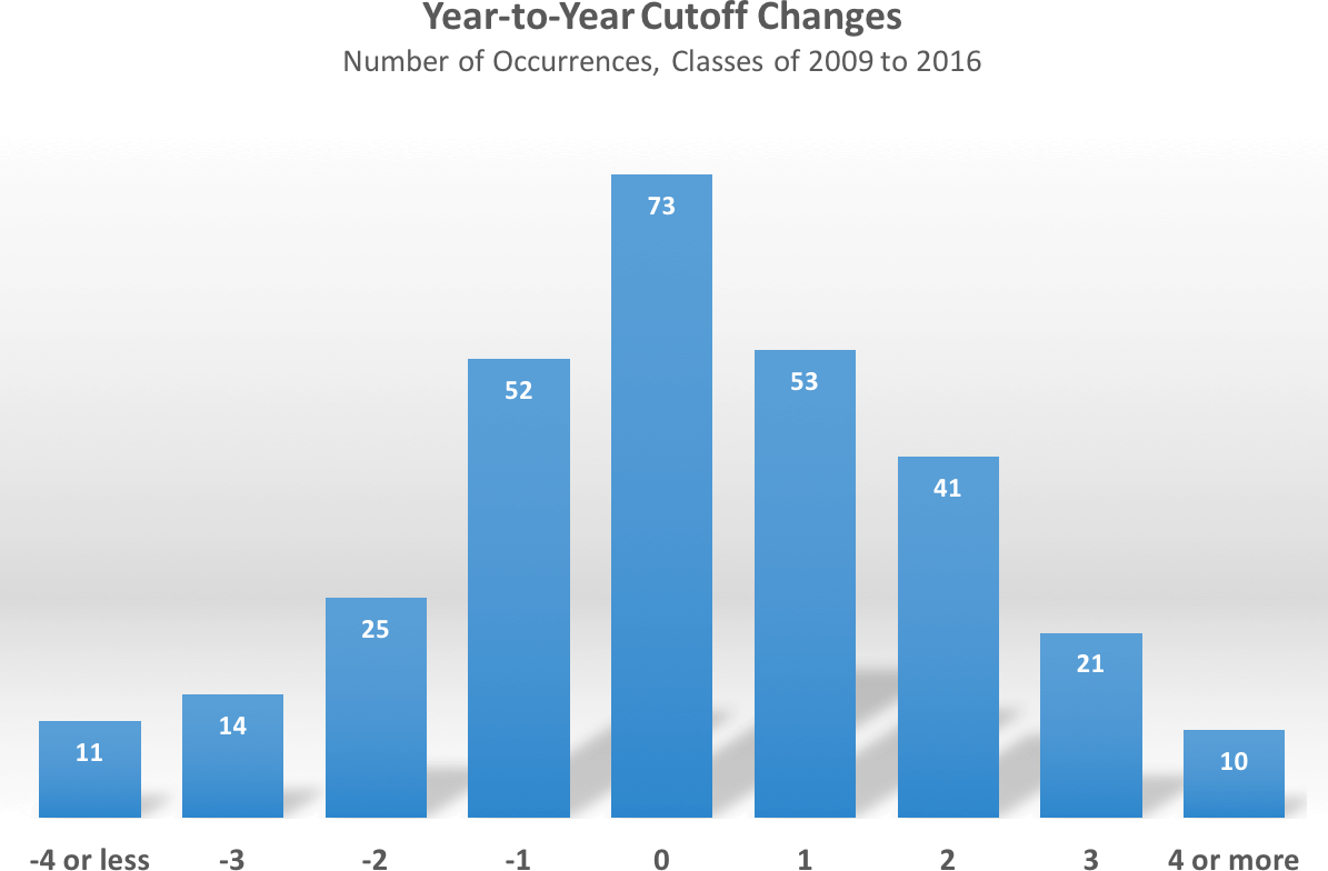
The chart above uses the year-to-year changes in state cutoffs to emphasize my refrain on thinking of NMSF estimates as ranges rather than points. The chart shows, for example, that 53 out of 300 times (50 states x 6 years) a state’s cutoff has increased by one point over the prior year. It also shows that the best, simple estimate of a state’s cutoff is the previous year’s cutoff. This makes sense, as there is not a strong trend in NMSF cutoffs. But that best estimate is only right one time out of four. That’s a spectacularly bad barroom bet. Even taking a range of -1 to +1 ups the odds of guesstimating a year’s cutoff to only 60%. Not until we look at a range of -2 to +2 do we encompass 90% of actual changes. Sharp-eyed readers will note that there should be 350 data points rather than 300. The cutoffs for the class of 2013 are so anomalous that they need to be thrown away. When 49 states show a decline in scores — Alaska fell by 8 points! — and then 49 states bounce back the following year to their historical averages (only Louisiana was spared), it’s best to pretend that the year never happened.
The chart reflects old PSAT classes, so these years had stable content, a stable scale, and a relatively stable testing population. Yet the best estimates could still only hit the exact mark 25% of the time. Factor in an overhauled test, a revamped scale, and some important changes to the test group, and you have an even more challenging landscape. One offsetting factor for class of 2017 estimates is that the compression on the cutoff range means that there are simply fewer wrong doors to open. The old PSAT had state cutoffs that spanned a 20-24 point range of Selection Index values. Now that the Commended cutoff for the class of 2017 is known, we can say that this year’s span is likely to be no more than 12-14 points. We also have additional insight into some state data that allows ranges to be narrowed. Still, it’s an important reminder that even the best estimates will be wrong.
I’ve at least tried to develop the best estimates. A rough order of operation involves consideration of the following factors:
- Class of 2016 Cutoffs
- PSAT Concordance
- Commended Cutoff Change
- National Hispanic Recognition Program Cutoff Changes
- School/District Data (State Estimates)
- Best Fit Trend Line
- Weighted Average and Variability
- Historical Rank Order
- Special Considerations
Factors 1 and 2 helped establish our original cutoff estimates and I’ll refer to those with a link to the previous methodology. A goal in revising the NMSF cutoff estimates was to throw away as much bad sample data as possible. With few exceptions, all College Board data released in January was based on sample groups. The most important bit of new information is the Commended cutoff of 209. This figure sets the baseline for all Semifinalist cutoffs. A less well-known merit program, the National Hispanic Recognition Program, is administered directly by the College Board. NHRP cutoffs are established by region. The four regions for which I have found data for the classes of 2016 and 2017 are Southwest, West, New England, and the South. Testmasters has published interesting data from the Houston Independent School District that narrowed down the Texas range. The school information we have received in California lets us narrow that state’s range. Texas and California are important because they tell us about the high end of state cutoffs and are useful when considering the rank order of states. Below I’ve plotted out the class of 2016 Selection Index cutoffs versus the class of 2017 Selection Index cutoffs.
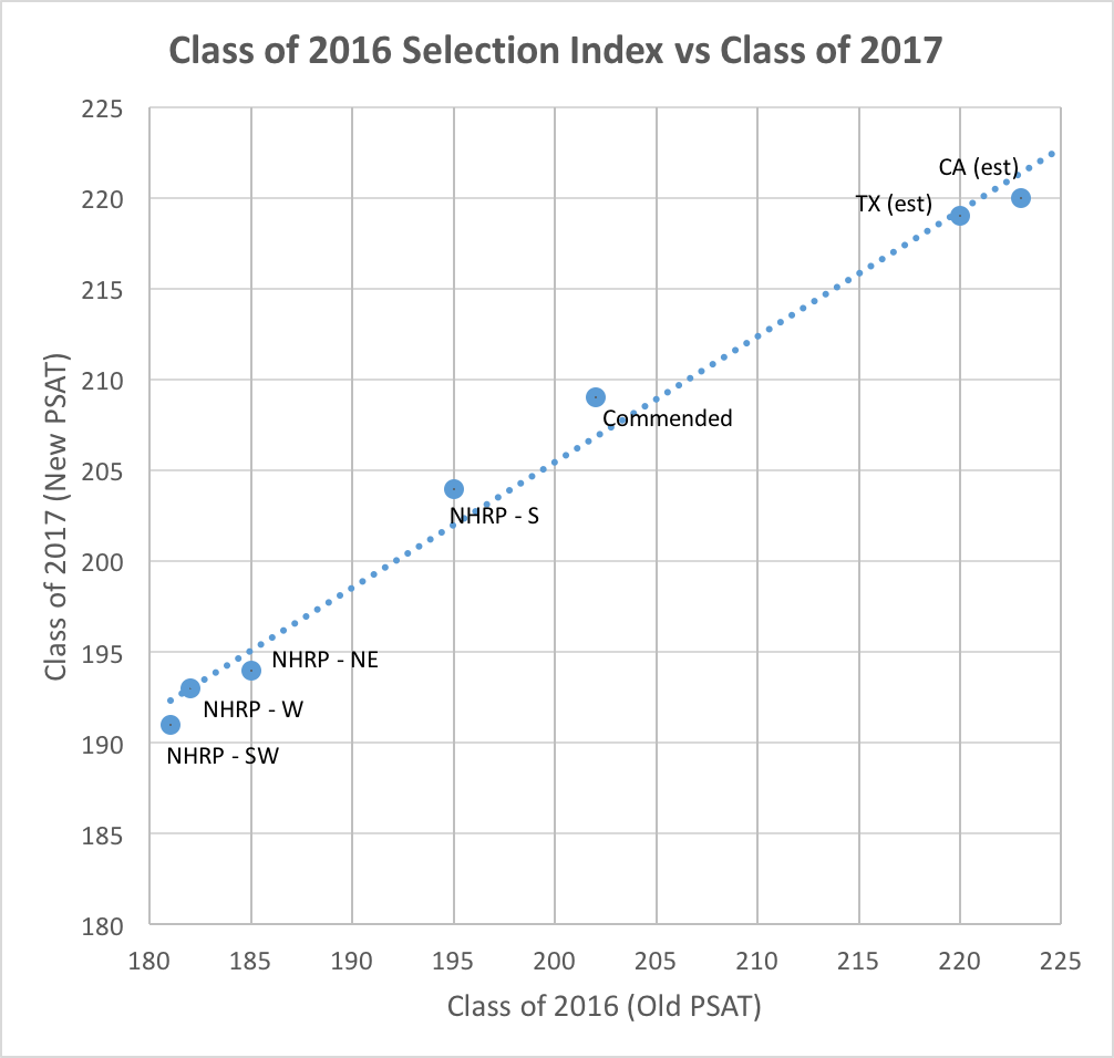
A linear trend line fits the data well. The slope of approximately 0.7 also fits what we know about score compression from our earlier work. For a variety of reasons, scores on the New PSAT have been pushed up on the bottom and pulled down from the top. The test changes were not designed to intentionally impact the NMSF cutoffs in this way; the compression is more of a by-product. [See this post on PSAT score compression for more information.]
The linear fit has one major problem — it doesn’t pass through the Commended point. It would not make sense to use such a line — at least without adjustment — since it would be guaranteed to get many states wrong. There is always a danger of overfitting data when you spend too much time poking and prodding a thin data set, so I wanted to keep the basic model simple. With a quadratic solution, I was able to achieve a better fit and, most important, pass through the (202, 209) point.
Does this mean everything is solved? No. The equation can be wrong — for example, we don’t know the Texas and California cutoffs with certainty. And any state can be above or below the curve. I think it’s an excellent starting point for cutoff ranges, though, and have tried to vary from it only for specific reasons.
One thing I wanted to assess was how well the class of 2016 represented a state’s historical performance. I decided to look at a weighted average of cutoffs from the last 7 years (really only 6, because the class of 2013 was eliminated). I arbitrarily applied weights of 6, 5, 4, 3, 2, 1 to favor more recent years. Below you can see that the class of 2016 represented a significant down year for some states and a significant up year for others (most were in a range that I consider a toss-up). I present that data so that you can make your own decisions as to how to consider it. I chose to keep the differences in mind when establishing my “most likely” estimates and my ranges, but I decided not to slavishly adjust things (the overfitting dilemma again).
| State | Class of 2016 | 6-Year Weighted | Difference | State | Class of 2016 | 6-Year Weighted | Difference | |
|---|---|---|---|---|---|---|---|---|
| Alabama | 209 | 209.2 | -0.2 | Montana | 204 | 206.1 | -2.1 | |
| Alaska | 206 | 210 | -4 | Nebraska | 209 | 209 | 0 | |
| Arizona | 215 | 213.2 | 1.8 | Nevada | 211 | 209.5 | 1.5 | |
| Arkansas | 204 | 204.7 | -0.7 | New Hampshire | 213 | 213.5 | -0.5 | |
| California | 223 | 221.9 | 1.1 | New Jersey | 225 | 223.7 | 1.3 | |
| Colorado | 215 | 214.1 | 0.9 | New Mexico | 208 | 209 | -1 | |
| Connecticut | 220 | 220 | 0 | New York | 219 | 218.5 | 0.5 | |
| Delaware | 216 | 216.3 | -0.3 | North Carolina | 215 | 214.4 | 0.6 | |
| Dist of Columbia | 225 | 223.9 | 1.1 | North Dakota | 202 | 202.4 | -0.4 | |
| Florida | 214 | 212.8 | 1.2 | Ohio | 215 | 213.9 | 1.1 | |
| Georgia | 218 | 216.6 | 1.4 | Oklahoma | 208 | 207.8 | 0.2 | |
| Hawaii | 214 | 214.6 | -0.6 | Oregon | 215 | 216.1 | -1.1 | |
| Idaho | 208 | 209.8 | -1.8 | Pennsylvania | 217 | 216.2 | 0.8 | |
| Illinois | 215 | 215.2 | -0.2 | Rhode Island | 212 | 213 | -1 | |
| Indiana | 213 | 213.1 | -0.1 | South Carolina | 211 | 210 | 1 | |
| Iowa | 208 | 208.6 | -0.6 | South Dakota | 202 | 204 | -2 | |
| Kansas | 213 | 213.4 | -0.4 | Tennessee | 212 | 212.3 | -0.3 | |
| Kentucky | 210 | 210.2 | -0.2 | Texas | 220 | 218.5 | 1.5 | |
| Louisiana | 211 | 209.3 | 1.7 | Utah | 206 | 206.9 | -0.9 | |
| Maine | 211 | 212.4 | -1.4 | Vermont | 214 | 214.5 | -0.5 | |
| Maryland | 222 | 221.6 | 0.4 | Virginia | 222 | 220.4 | 1.6 | |
| Massachusetts | 223 | 223.1 | -0.1 | Washington | 219 | 219.1 | -0.1 | |
| Michigan | 210 | 209.9 | 0.1 | West Virginia | 202 | 202.3 | -0.3 | |
| Minnesota | 214 | 214.5 | -0.5 | Wisconsin | 208 | 208.6 | -0.6 | |
| Mississippi | 209 | 206.9 | 2.1 | Wyoming | 202 | 202.9 | -0.9 | |
| Missouri | 209 | 210.5 | -1.5 |
A useful way of applying a reality check to the estimates is to look at historical rank order. For example, over the last 8 years, California’s cutoff has been 2 to 4 points higher than Texas’. Compression is likely to reduce that to 1-3 points, but estimates that have them closer or further apart are likely flawed. Readers have been kind enough to point out when I’ve deviated too much in this regard.
Special Considerations and Investigations
Here is where I will provide any updates on “special cases” as well as miscellaneous information that I find useful or interesting in analyzing NMSF cutoffs.
In a reply to a comment from a Michigan parent in our cutoff post, I gave an example of one such “special case.” Michigan’s cutoff may increase beyond its historical norms. The state began universal PSAT testing in October 2015. We don’t know exactly how this will impact scores, but I’ve explored one way of thinking about it. Is there a relationship between the Selection Index and the percentage of test-takers qualifying as Semifinalists? Since the number of Semifinalists is fixed by student population, more students taking the PSAT lowers the percentage of test-takers qualifying. For example, if a state has an allocation of 100 Semifinalists and 10,000 test-takers, 1% of test-takers qualify. If the number of test-takers increases to 20,000, then only 0.5% of test-takers qualify. Below is a chart for the class of 2014 (the last group for which data are available) mapping NMSF cutoff to a state’s Semifinalist to test-taker percentage.
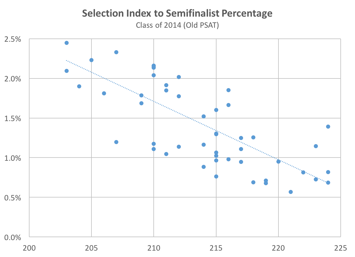 States with the lowest ratio of NMSFs to testers such as New York, New Jersey, and Connecticut tend to have the highest (or higher) cutoffs. States with the highest ratio of NMSFs to testers such as Wisconsin, Michigan, and Iowa tend to have lower cutoffs. The 11 states with 2% or more of testers achieving NMSF honors had cutoffs ranging from 203-213 (old PSAT). The 14 states with 1% or fewer testers achieving NMSF honors had cutoffs ranging from 214-224. Why is all of this math important? If Michigan tripled or quadrupled its PSAT testers in October 2015, it would move from the first group to the second. Correlation is not causation, so it’s highly speculative as to whether Michigan will see a big cutoff change.
In another reply to that post, I speculated that the same thing could happen with Illinois. However, that state has not yet implemented wide-scale changes in PSAT testing. As of April 2016, I don’t know of any states that could see as dramatic a test-taker swing as Michigan. A problem unique to this class year is that College Board has been unable to publish the PSAT state reports that it typically releases in January (all resources have been devoted to the New SAT launch and reporting). We don’t expect to see these until at least May. While it is unlikely that they would impact our estimates much, they can provide another point for triangulation and confirmation.
The Problem with Percentiles
I sometimes see students and parents trying to estimate cutoffs by looking at percentile scores. I can not emphasize enough how flawed that is. For example, we estimate that as many as 100,000 students had reason to believe that their 97th percentile or higher Selection Index scores would qualify them for National Merit honors (Commended, Semifinalist, or Finalist). In fact, only half that number actually qualify. Students with a 205 Selection Index were reported at the 99th percentile and were misled into thinking that they might be Semifinalists. We know that no student in any state will make Semifinalist without a 209 or above.
Why are percentiles so problematic? Reasons 1, 2, and 4 are applicable to the New PSAT, and you can read my in-depth post on the topic. The other three reason are applicable to percentiles more generally.
- Percentile definitions changed for the New PSAT from percentage of students below a score to percentage of students at or below.
- The percentiles reported with October 2015 reports were based on unrepresentative samples.
- Percentiles are rounded, so even the same values can represent varying numbers of students.
- Score compression on the New PSAT means “fatter” score levels (more students at each Selection Index) and an exaggeration of problem #3.
- Percentiles lag a class year or are based on samples only.
- Cutoffs are at the state level and percentiles are at the national level.
Originally you stated NY SI range was 217-220 and now you believe 219 will be the cut off score? Is this 100%??
Lisa,
No, I have not yet received any information that confirms a NY cutoff, so it is far from 100%. I continue to believe that it will fall in the 217-220 range. I have the “most likely” as 218, but that’s only based on my estimates. I will be sure to mark information that is based on actual results. For large states like NY, I hope we can have information soon.